 Check out this amazing blog post over from Plain and Fancy Cabinetry! We have the post here below, but you can also view it along with all of there other amazing posts here. https://plainfancycabinetry.com/blog/category/inspiration Color trends are constantly shifting — and what, exactly, is in style can differ depending on who you ask. Many people look to the concept of the color of the year for insight. Several colors of the year exist, however, and these often seem to have little rhyme or reason. If you seek insight on color trends from ten different paint companies or high-end designers, you'll receive ten different opinions as to which hue is the hottest of the season. Many companies struggle to select just one option, often settling on a full spectrum of colors that reference not only their own preferences, but also, where their clients and customers show interest at any given time. Geography can add further trend-based variety; the looks that resonate in New York, for example, might not catch on as quickly in Chicago, Miami, or other style Meccas. On a national level, the media tends to hype up color of the year designations, and with good reason: an authority announcing the annual hue makes for a great headline. These stories guarantee reader interest, as people love to speculate on the latest looks. Given all this, any colors of the year we reference at Plain & Fancy should be taken with a grain of salt. We enjoy discussing the hottest hues of the season but also acknowledge that trends alone may not be sufficient as a basis for your cabinet selection process. It's important to consider other factors, including durability, room size, interest in patterns, and, most importantly, your personal preferences. If you're not fond of a particular color or it simply falls short of reaching your grand vision for your upcoming design project, it's perfectly fine to abandon the latest trends — especially once you realize how much these vary and as such, how difficult it is to remain at the cutting-edge of interior design. Still, with help from the experts at Plain & Fancy, you can make the most of this year's trends while also achieving an enduring look that you'll love not just now, but in years to come. COLORS OF THE YEAR FOR 2021: WHICH HUES WILL HIT IT BIG THIS YEAR? We may be skeptical of the concept of the color of the year, but we still believe that these selections can be a great source of inspiration. If you're at a loss for ideas, the latest collections of trending colors may get you on the path to your ideal hue. You'll find plenty of exciting options for 2021 — especially if you're fond of warm or earthy tones. Not sure where to start? Below, we've highlighted a few of the most noteworthy designations from top color authorities, including today's most trusted paint providers.] 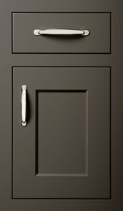 SHERWIN-WILLIAMS Sticking with the preference for grey-oriented neutrals that has dominated the industry in recent years, Sherwin-Williams selected a versatile look for its 2021 color of the year: Urbane Bronze. This simple tone reflects a growing need for serenity within the often complex world of interior design. At first glance, Urbane Bronze might not seem particularly exciting, but look again and you'll be struck by its calming nature — exactly what you and your loved ones need in 2021. As the Sherwin-Williams color marketing director explains, comforting and adaptable colors such as Urbane Bronze make it easier to establish the home as a personal haven during times of uncertainty. Still, this look should have no trouble remaining relevant in the future. To make the most of Urbane Bronze, be sure to layer with complementary tones, including not only beige paints, but also, white oak or ash cabinets. Copper and wrought iron details can instantly add a hint of sophistication to any space decked out with this neutral hue. 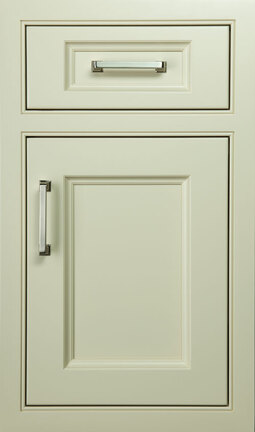 VALSPAR Rather than stick with a single color for 2021, Valspar has opted for twelve muted hues, all of which encourage the peace of mind that we so desperately need in the new year. Referred to by the company as "fresh and familiar," these colors aim to make you feel as cozy as possible while still delivering a slight edge of energy. While this year's Valspar paints cover the full color spectrum, all have a soft, comforting feeling. Shades of blue, grey, and cream are heavily represented, but there's something for everyone in this modern collection. Key colors include:
FARROW & BALLLike Valspar, Farrow & Ball designates a variety of colors of the year. These shades tend to be earthy, although several rich colors are also included for 2021. This year's favorites reflect a general preference for warmer tones over the cooler looks that once dominated color of the year selections. Chosen by curator Joa Studholme, these tones cover the gamut, bringing both comfort and adventure to the homes and other spaces in which they're incorporated. This year's versatile colors from Farrow & Ball are divided into four distinct categories. These include: RICH AND WARMThe most indulgent of Farrow & Ball's colors of the year invite you to pamper yourself a little. You deserve to relax in a rich and welcoming environment.
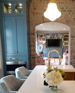 CLEAN AND TIMELESS BLUES
The right shade of blue is always a winner in a relaxed environment, but this collection can also work nicely in formal settings if paired with rich, contrasting woodwork.
EARTH COLORSBy now, it should be no secret that earthy shades are a big deal in 2021. It's only fitting, then, that this preference is reflected with a dedicated collection of Farrow & Ball colors of the year.
NATURAL GREENSIf you constantly crave time in the great outdoors, you'll love the forest feel of these shades of green:
CHOOSING THE BEST COLOR OF THE YEAR FOR YOUR HOME With so many different colors supposedly hitting it big in 2021, keeping up with the so-called trends can be difficult. How can you create a stylish interior when you don't actually know which look is on-trend? Another important consideration: which colors will remain relevant when 2022 arrives, along with its many new colors of the year? Ultimately, the color of the year concept fails to take into account the individual's unique needs and aesthetic preferences. This problem has been mitigated to an extent with the establishment of color collections, but even these neglect to capture the full range of possibilities available when a specific trend takes over. Rather than blindly follow the trends referenced by a particular paint manufacturer, consider a more nuanced approach that makes sense based on your design plans. Our team at Plain & Fancy can guide this process. Our designers love to collaborate; they take the time to get to know each client before offering well-informed recommendations. You'll adore the colors, textures, and styles they highlight. Of course, if your heart is set on a specific color from 2021, you can count on our experts for a great match. |
Search TopicsCategories
All

Follow Us |
 RSS Feed
|
Phone Numbers
Farmingdale:
(631) 957 - 6800 Smithtown
(631) 656 - 0936 |
Showroom Hours
|
Email & Social
|
Copyright © 2023 Lakeville Kitchen & Bath.
All Rights Reserved. Privacy Policy
Quality Cabinetry Since 1935.
All Rights Reserved. Privacy Policy
Quality Cabinetry Since 1935.